The Biggest Mistake Restaurants Make With QR Menus
Most people don't hate QR menus. They hate bad digital experiences. After six months of watching real guests use our menu, I realised the industry has been solving the wrong problem.
“I wish they’d just given me a paper menu.”
It’s probably the most common criticism of QR menus.
And honestly, I understand where it comes from.
But after spending months watching real guests use digital menus in my wife’s restaurant, I’ve come to a different conclusion. I don’t think people dislike QR menus. I think they dislike bad digital experiences.
When you stop and think about it, we scan QR codes all the time. We use them for boarding passes, train tickets, parking, payments, Wi-Fi and countless other everyday tasks without giving them a second thought. The QR code itself isn’t the problem. What comes after it often is.
We’ve been asking the wrong question
When we first started looking for a QR menu for Bell & Bastion, we assumed we’d find something we’d genuinely enjoy using.
Instead, most products felt remarkably similar. Some were little more than PDFs displayed on a phone. Others looked modern enough, but became frustrating the moment you wanted to jump between sections, compare dishes or quickly find something vegetarian.
The more products I tried, the more I realised the industry seemed to have started with the wrong question.
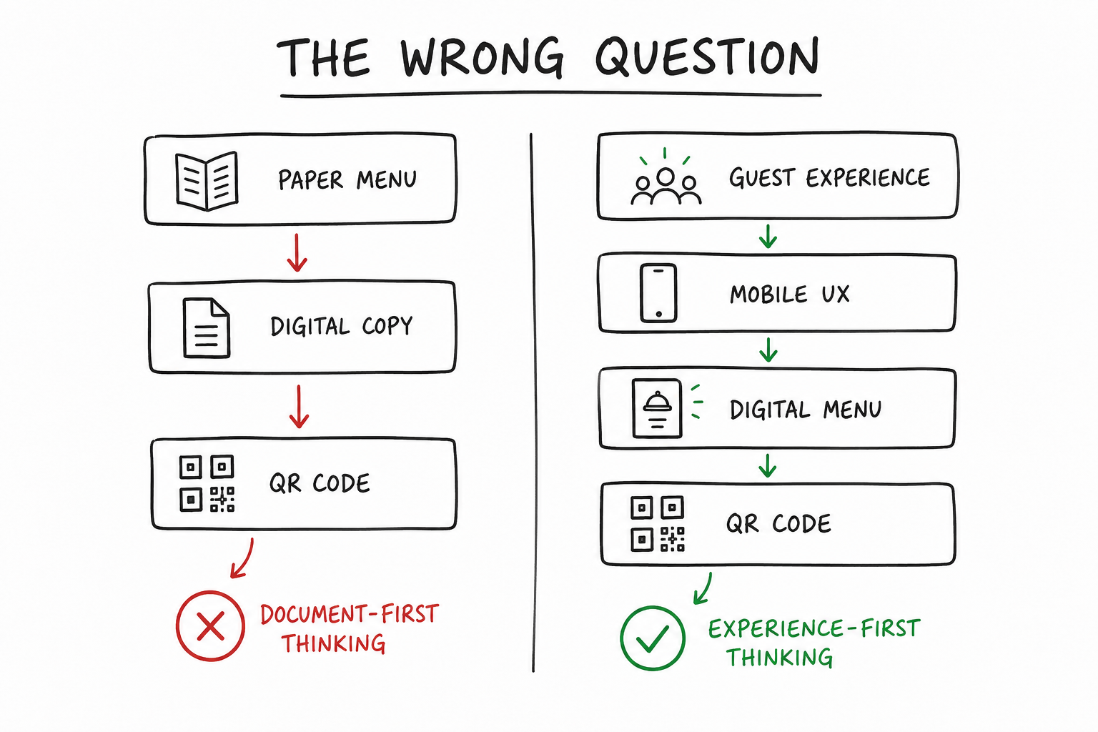
Instead of asking:
How do people naturally browse a menu on their phone?
many products seemed to ask:
How do we put a paper menu onto a screen?
Those sound similar.
They’re not.
One is about recreating a document. The other is about designing an experience.
A phone isn’t a smaller sheet of paper
Almost every QR menu is viewed on a phone, yet surprisingly few feel like they were designed specifically for one.
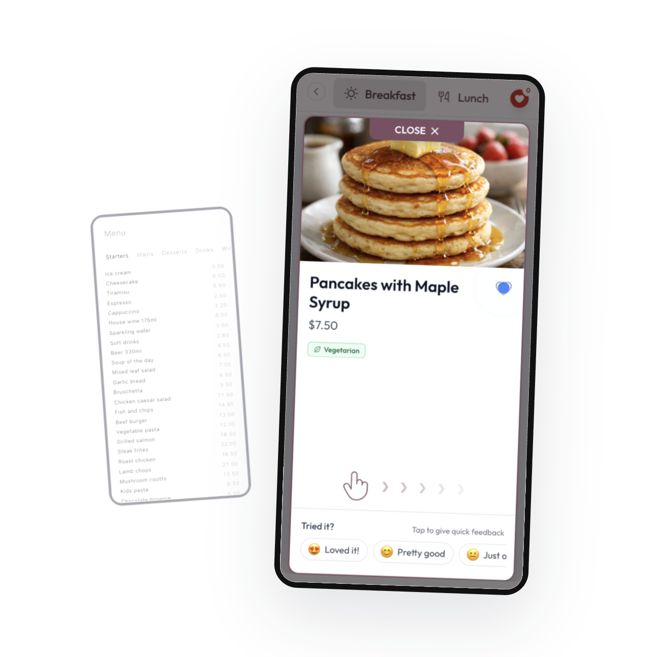
Tiny tap targets, endless scrolling, poor typography and confusing navigation are all surprisingly common. Rather than feeling like a modern mobile app, many digital menus feel like printed menus that have simply been squeezed onto a six-inch screen.
A great mobile experience should feel native to the device people are actually using. That sounds obvious, but in reality it’s surprisingly rare.
“Don’t make me think”
One of the books that had the biggest influence on me during my years at Hotjar was Don’t Make Me Think by Steve Krug.
Its central idea is beautifully simple. Good interfaces shouldn’t need explaining. People should instinctively know what to do next. The best user experiences are almost invisible.
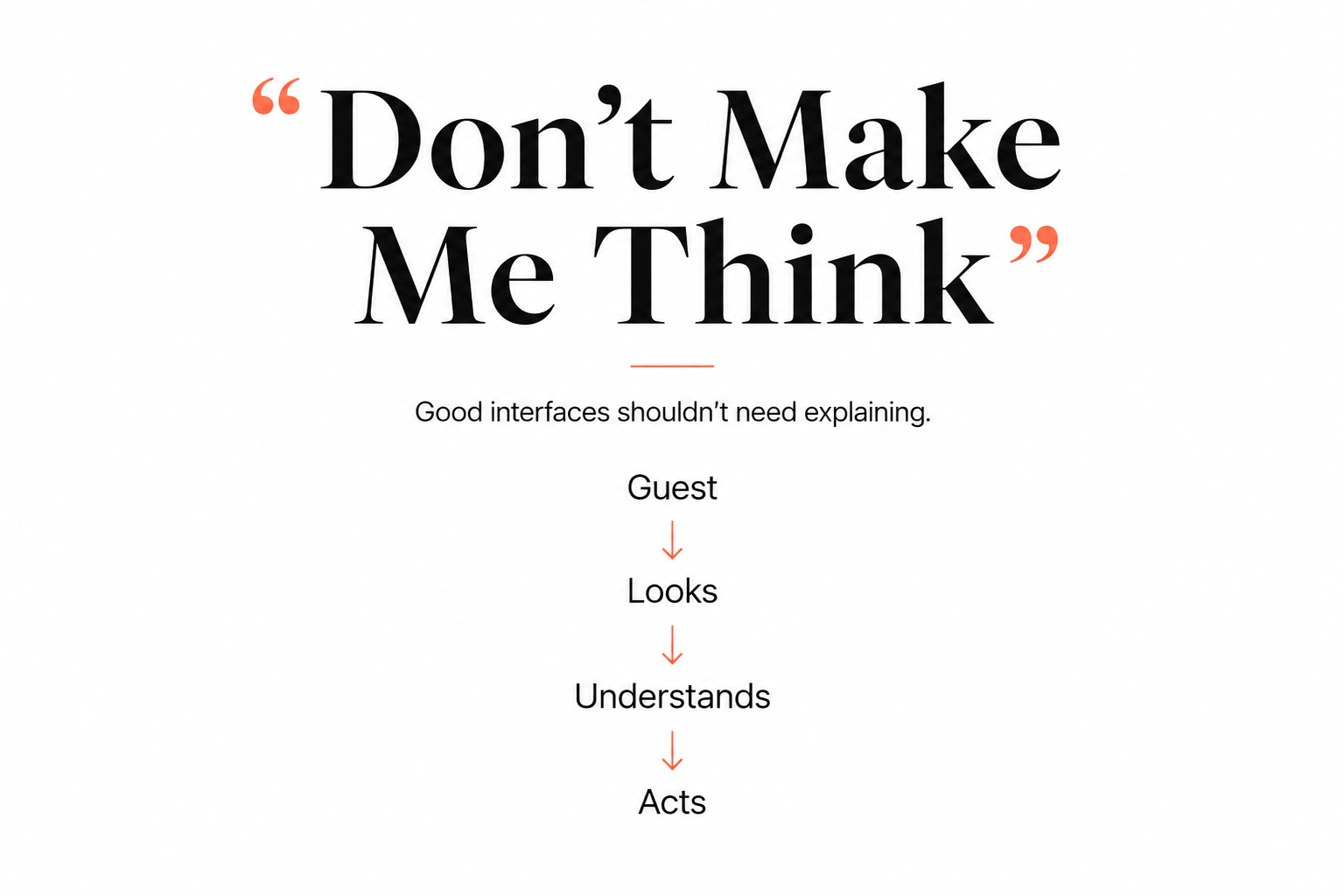
I found myself thinking about that constantly while watching guests browse restaurant menus.
If someone has to stop and work out how to find desserts, can’t quickly spot vegetarian dishes or has to think about how to navigate, the interface has already created friction.
Most guests won’t complain about that.
They’ll simply work around it. Or quietly decide they preferred the paper menu.
Every guest experiences your menu
One thing that’s surprised me since becoming involved in the restaurant industry is how little attention menus sometimes receive.
Which is understandable.
Running a restaurant is hard. You’re managing suppliers, staffing, food quality, service, costs and countless other moving parts. The menu often becomes something you create once and then only revisit when prices change.
But every single guest uses it.
Not everyone orders dessert. Not everyone chats with the server. Not everyone leaves a review.
But everyone uses the menu.
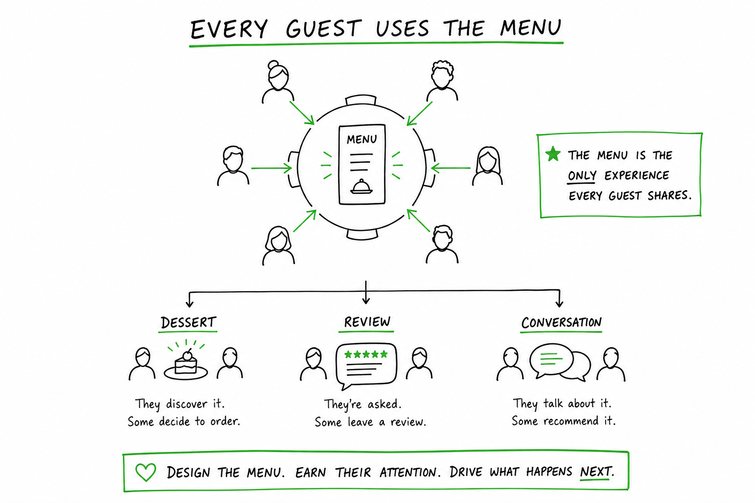
It’s one of the few experiences every customer shares, and it shapes their first impression long before they’ve tasted the food. That makes it far more important than many people realise.
Real guests will always surprise you
One of the biggest advantages we had while building BellQR was that we weren’t designing it in isolation.
For six months, I was often building new features while sitting at Bell & Bastion itself. I’d make a change, deploy it, and before long I could see real guests interacting with the new version.
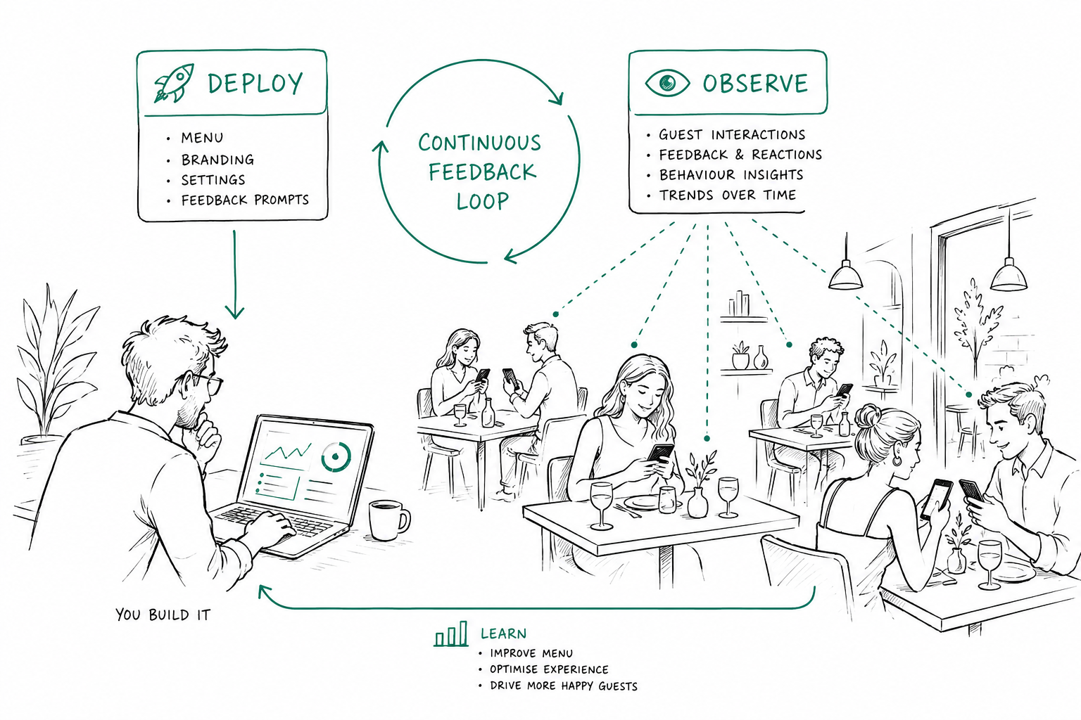
It created an incredible feedback loop.
Sometimes a small tweak immediately made the menu feel easier to use. Other times I’d realise something I thought was obvious wasn’t obvious at all.
I have to admit, I probably looked like a bit of a stalker.
Whenever I had the chance, I’d find myself watching guests use the menu. Not because I was interested in what they ordered, but because I wanted to understand where they hesitated, what confused them and what felt completely natural.
Those observations shaped BellQR far more than any brainstorming session ever could.
One evening I noticed something I’d never anticipated.
A guest held their phone out to the server and said, “I’m deciding between these.”
They weren’t pointing around the menu or trying to remember dish names. They had saved the dishes they were interested in and were using that list to have a conversation with the server.
It was one of those moments where you realise people have found a better way of using your product than you had imagined yourself.
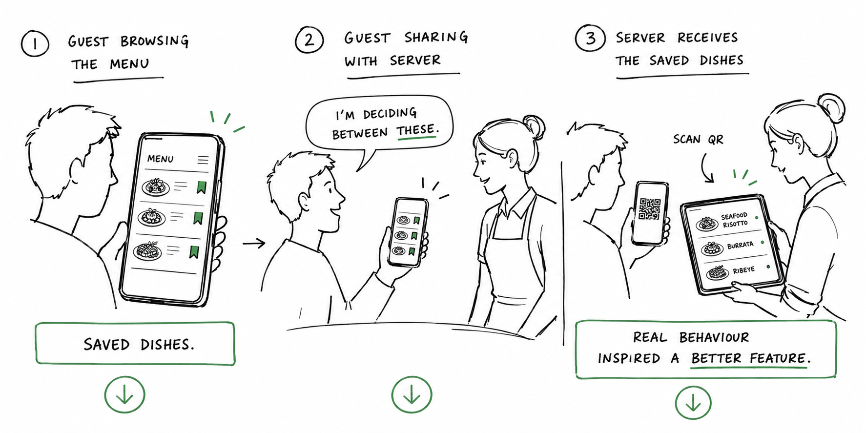
So we built another feature that lets the server scan a QR code on the guest’s phone and instantly see that saved list on their own device. We never advertised it or explained how to use it. Guests simply started using it because it solved a real problem.
That experience reminded me of one of the biggest lessons from my years at Hotjar. You learn far more by watching what people do than by guessing what they’ll do.
Real behaviour almost always beats assumptions.
Digital doesn’t have to replace paper
I also think we’ve created a false choice.
People often talk as though restaurants have to choose between paper menus and digital menus.
I don’t believe that’s true.
In fact, I think paper menus will always have a place. For many restaurants they’re part of the atmosphere and the dining experience, and some guests genuinely prefer them. That’s absolutely fine.
But that doesn’t mean digital menus don’t have a role.
A digital menu can make it easier to browse a large wine list, explore seasonal specials, filter dishes by dietary requirements or instantly switch language without printing multiple versions.
For restaurants with extensive food or drinks menus, it can actually improve the guest experience while allowing the printed menu to stay simple and approachable.
The goal shouldn’t be to replace paper.
It should be to give guests the best experience possible.
Often, that means using both.
The industry has been solving the wrong problem
The more time I’ve spent building BellQR, the more convinced I’ve become that many QR menu companies are solving the wrong problem.
Their goal seems to be creating a digital version of a paper menu.
I don’t think that’s the job.
I think the job is to use a digital menu to help create a memorable experience for guests.
A menu should help people discover dishes, make confident decisions, navigate effortlessly and feel excited about what they’re ordering. It should also help restaurants understand what’s working, where guests are getting stuck and how the experience can keep improving.
In other words, it shouldn’t simply display information.
It should quietly make the dining experience better.
Final thoughts
Looking back, I don’t think restaurants were ever asking for QR menus.
They were asking for menus that were easier to update. Menus that worked beautifully on the devices guests already carry. Menus that made choosing effortless instead of frustrating.
QR codes just happened to be the delivery mechanism.
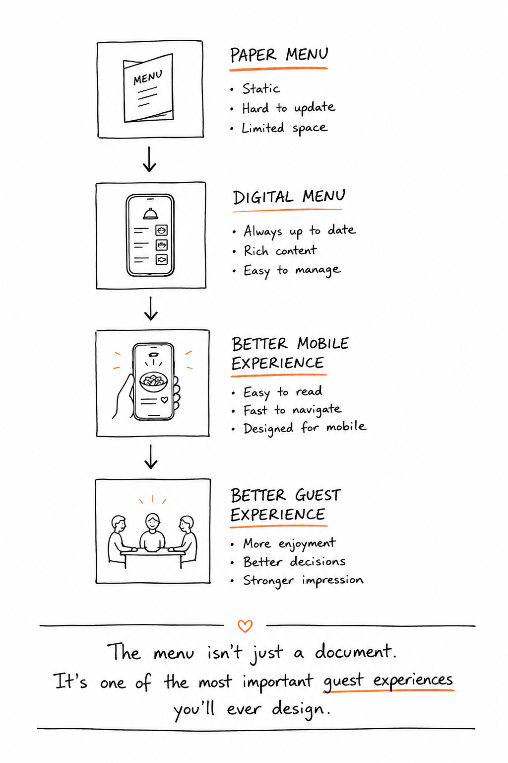
That’s why I don’t think the future belongs to QR menus.
I think it belongs to restaurants that see the menu for what it really is.
Not a document.
Not simply a list of dishes.
But one of the most important guest experiences they’ll ever design.