Why Modern Restaurants Are Moving to QR Menus (And Why We Ended Up Building Our Own)
Most QR menus were designed to replace paper menus. We believed they should create a better experience for guests instead. This is the story of how a problem at my wife's restaurant, years spent building Hotjar, and an obsession with user experience led to the creation of BellQR.
When my wife opened Bell & Bastion, a rooftop bar and restaurant in Gozo, I naturally ended up helping with the tech side of things.
Like most restaurants, one of the first challenges we ran into was the menu.
At first, it didn’t seem like a particularly interesting problem to solve. Every now and then we’d tweak a few dishes, adjust some prices, print a fresh batch of menus, and move on.
At least, that was the plan.
In reality, the menu changed far more often than we expected. Seasonal dishes came and went. Prices needed updating. New cocktails were added. A few dishes disappeared. Every change meant another round of printing, and before long it felt like we were constantly throwing away perfectly good menus because something had changed.
Naturally, we started looking at QR menus.
The QR menus we found weren’t very good
There was just one problem.
We couldn’t find one we actually enjoyed using.
Some were little more than PDFs squeezed onto a phone screen. Others looked nice enough, but became frustrating the moment you wanted to jump between sections or quickly find something vegetarian. A few were surprisingly slow to load, despite doing very little.
It didn’t take long to understand why QR menus had developed such a bad reputation.
The problem wasn’t that people disliked using their phones.
The problem was that many QR menus simply weren’t designed for phones.
Maybe it’s the product person in me, but I became slightly obsessed with the idea that there had to be a better way.
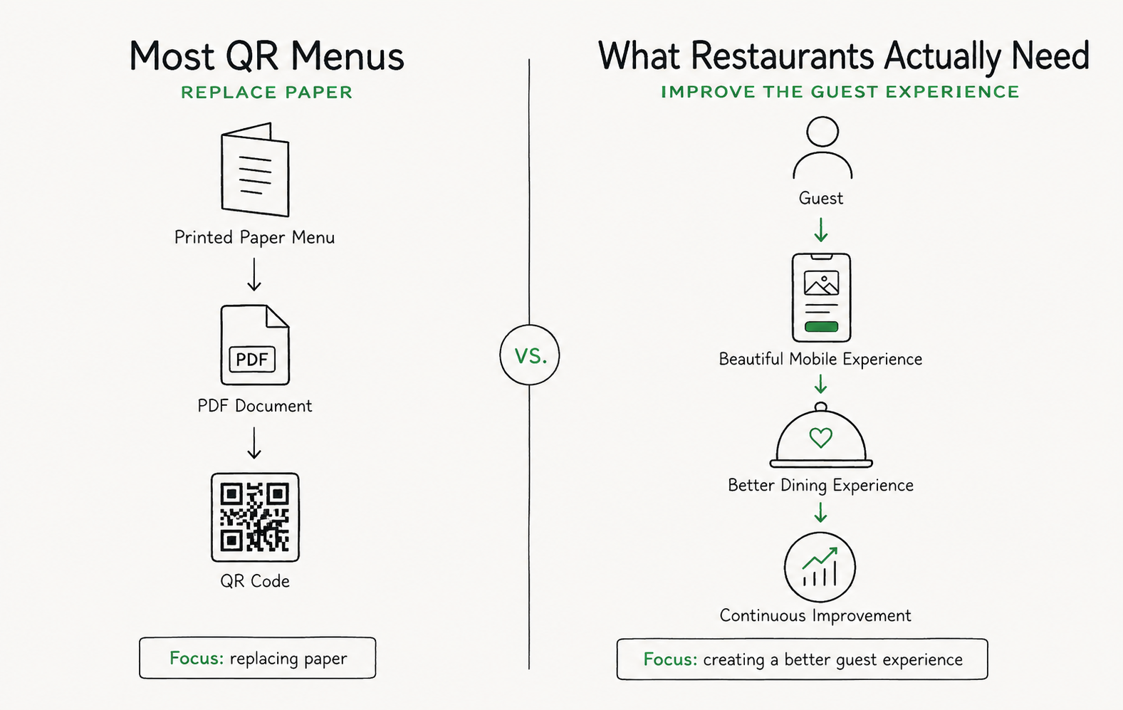
Most QR menus focused on digitising paper. We believed the real opportunity was creating a better guest experience.
Looking at menus through a different lens
Years earlier, I’d spent almost a decade helping build Hotjar. We spent countless hours trying to understand why people got stuck on websites.
What frustrated them?
What made them leave?
Why could something as small as changing a button or simplifying a page sometimes have such a dramatic impact?
Without really realizing it, I started looking at restaurant menus through exactly the same lens.
How do guests actually browse a menu?
Where do they get stuck?
What makes choosing a dish feel effortless?
And how can a restaurant learn what’s working and what isn’t, so they can keep improving?
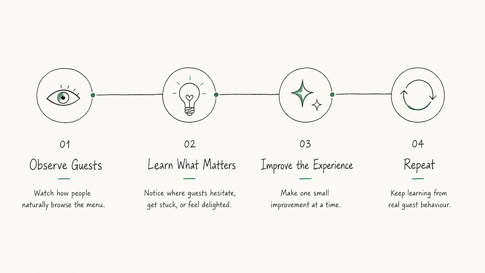
The same philosophy we used to improve websites at Hotjar eventually shaped how we approached restaurant menus: observe, learn, improve, repeat.
One lesson I’ll never forget from Hotjar
One of the biggest lessons I took away from Hotjar was that people rarely tell you when an experience is frustrating.
More often than not, they simply leave.
On a website, that means closing the tab.
In a restaurant, it’s more subtle.
Maybe they skip dessert because they never noticed it.
Maybe they order the same safe dish every visit because they didn’t spot something they’d have loved.
Maybe they leave feeling that the experience was “fine”, without ever being able to explain why.
Friction doesn’t always announce itself.
Sometimes it quietly chips away at what could have been a great experience.
The biggest opportunities to improve an experience often come from the things customers never tell you.
That made me wonder.
If companies spend months optimizing a checkout page because a small improvement can increase conversions, why do we accept menus that force guests to pinch and zoom through PDFs?
For most restaurants, the menu is one of the first things every guest interacts with.
It influences what they order, how much they spend, and often their first impression of the restaurant itself.
Surely it deserved the same level of attention.
So we decided to build our own
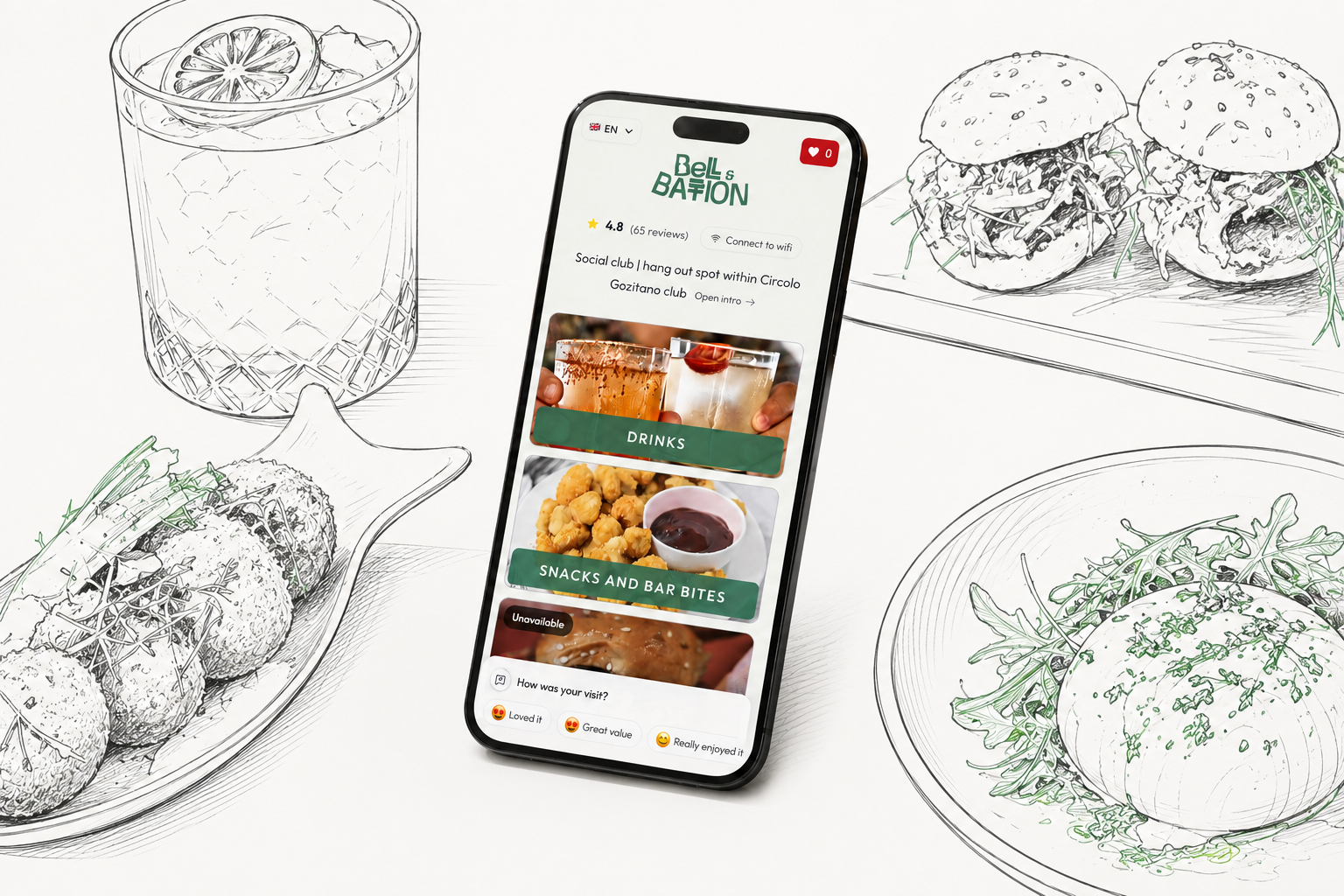
BellQR started as a menu for one restaurant. Every improvement came from watching real guests use it.
At first, it was just for Bell & Bastion.
The goal wasn’t to build a business. I simply wanted a menu that felt genuinely enjoyable to use.
A menu that loaded instantly.
That made it easy to jump between sections.
That let guests filter dishes based on dietary requirements.
That worked beautifully in multiple languages.
That didn’t feel like a PDF pretending to be an app.
Then something unexpected happened
Once we had a digital menu that guests actually enjoyed using, we started thinking about everything else it could do.
Guests could save dishes they were interested in while deciding.
The menu could quietly ask for feedback at appropriate moments instead of relying solely on public reviews.
We could see which dishes attracted the most attention and which sections people rarely visited.
Instead of guessing how guests experienced the menu, we could actually learn from it.
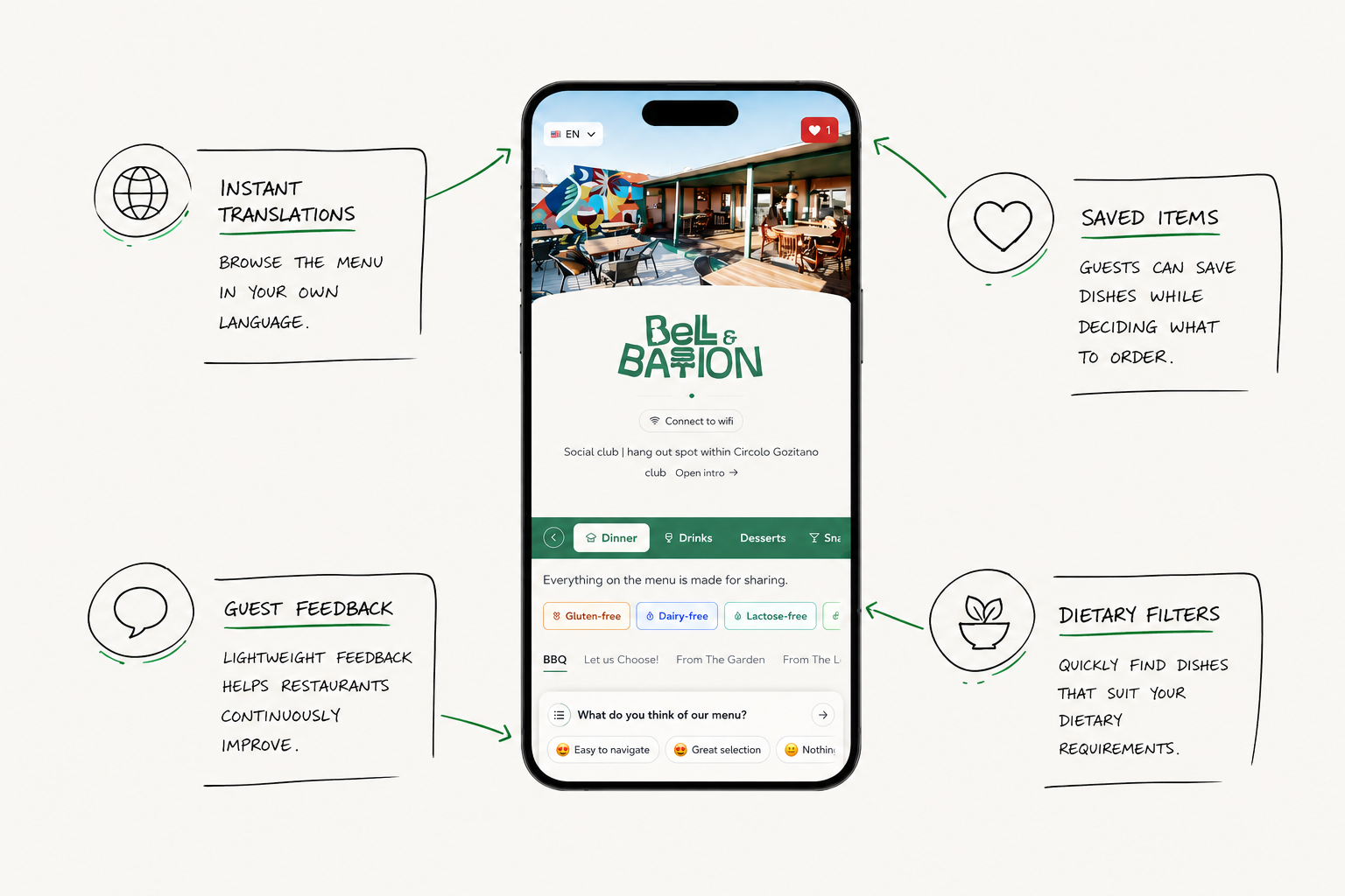
BellQR didn’t become a product overnight. It evolved through dozens of small improvements inspired by real guests.
That felt strangely familiar.
It reminded me of the same philosophy that made Hotjar so valuable to thousands of businesses.
The goal was never just to collect data.
The goal was to understand people well enough to build a better experience.
Watching real guests changed everything
Over the next six months, BellQR slowly evolved.
Not because we had a long list of features we wanted to add, but because we kept watching real guests use it.
Every hesitation. Every confused glance. Every moment where someone struggled to find something. Every small improvement came from observing real behaviour rather than making assumptions.
We’ve changed layouts. Reworded buttons. Simplified navigation. Added filters. Tweaked interactions that most people would never consciously notice. Ironically, that’s usually the point.
The best user experiences aren’t the ones people remember.
They’re the ones people never have to think about.
What makes a great QR menu?
After spending months testing BellQR with real guests, I’ve come to believe a great QR menu should:
- Load instantly. Guests shouldn’t be left waiting.
- Be designed for phones. Not adapted from a printed PDF.
- Make navigation effortless. Finding desserts or drinks should take seconds.
- Support dietary filters. Guests shouldn’t need to read every dish individually.
- Work beautifully in multiple languages. Especially in tourist destinations.
- Help restaurants learn. Feedback and guest behaviour should make the menu better over time.
Replacing paper is the easy part.
Creating a genuinely better guest experience is much harder.
But it’s also far more valuable.
Looking beyond QR codes
Looking back, I don’t think restaurants were ever asking for QR menus. They were asking for menus that were easier to keep up to date.
Menus that guests genuinely enjoyed using. Menus that helped them learn and improve over time.
QR codes just happened to be the delivery mechanism.
That’s why I don’t think the future belongs to QR menus. I think it belongs to better guest experiences. If QR codes help us get there, great. But they were never the destination.