Why the Best Restaurant QR Menus Help Guests Decide
What six months of quietly watching restaurant guests taught me about designing better menus.
I thought I was building QR menu software.
Looking back, I think I was learning how people make decisions.
My instinct was to begin with the technical problem. Build a beautiful digital menu. Generate a QR code. Make it fast and reliable. Add translations, dietary information and photographs. Give restaurants enough flexibility to make the menu feel like their own.
None of that was wrong. It just wasn’t the whole problem.
I only began to understand that when I started building the software inside a real restaurant.
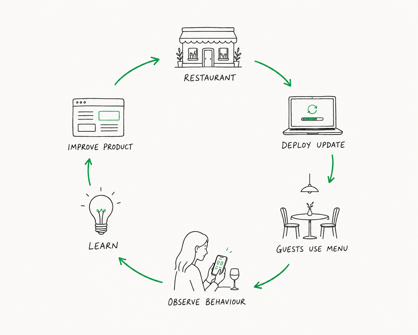
Without planning it, I had stumbled into one of the shortest product feedback loops I had ever experienced. I could deploy a change before dinner service, sit down in the corner of the restaurant with my laptop and watch guests encounter it a couple of hours later.
There were no scheduled usability sessions, carefully recruited test users or artificial tasks to complete. There were simply real people trying to choose dinner.
I occasionally wondered what I looked like from the other side of the room. Sitting alone with a laptop and repeatedly glancing towards other tables probably made me seem like a bit of a stalker. Fortunately, I wasn’t really watching people. I was watching behaviour.
Where did someone hesitate? Which dishes did they compare? What did they tap instinctively? What did they scroll past? When did they turn their phone towards someone else at the table? Which questions did they ask before placing an order?
The guests never knew they were helping to build the product that became BellQR. They thought they were simply choosing dinner, while every hesitant tap, confused scroll and moment spent comparing two dishes was quietly teaching me something.
Many of our best ideas began that way.
The problem after the QR code
A few months into building BellQR, I found myself on the other side of the experience.
I was having dinner at a restaurant in Sicily when I noticed a QR code on the table. By then, I had developed the habit of scanning digital menus everywhere I went. Every restaurant felt like a chance to see how someone else had approached the same problem, and I was genuinely excited to try it.
Within a couple of minutes, I realised I was doing exactly what I had spent months trying to prevent.
The menu offered an English version, but only some of the dishes had been translated. The rest were still in Italian. The categories were difficult to navigate, and finding something I had seen a moment earlier required repeatedly scrolling up and down.
At another table, a group of guests appeared to be having the same experience.
“Can you work out what this means?”
“I thought this was supposed to be in English.”
“Where did the desserts go?”
Nobody was complaining about the QR code. They had scanned it without difficulty and reached the menu exactly as intended.
They were frustrated by everything that came afterwards.
That distinction matters because conversations about QR menus tend to focus on the method of access. Some people love scanning them. Others would prefer a printed menu. Restaurants debate whether QR codes feel modern, impersonal, convenient or cheap.
But a QR code is only a doorway. It tells us almost nothing about the experience waiting on the other side.
People don’t dislike QR menus simply because they are digital. They dislike menus that make choosing harder.
The experience in Sicily did not make me question the value of QR menus. It reinforced why I had started building one. A digital menu can do things paper cannot, but only if it is designed around what guests are actually trying to accomplish.
And guests are not trying to operate menu software.
They are trying to decide what to eat.
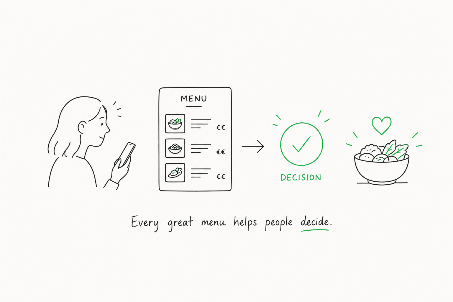
The best restaurant menus do not merely show what is available. They help each guest decide what is right for them.
Once I understood that, I began seeing the menu differently.
Guests were comparing possibilities
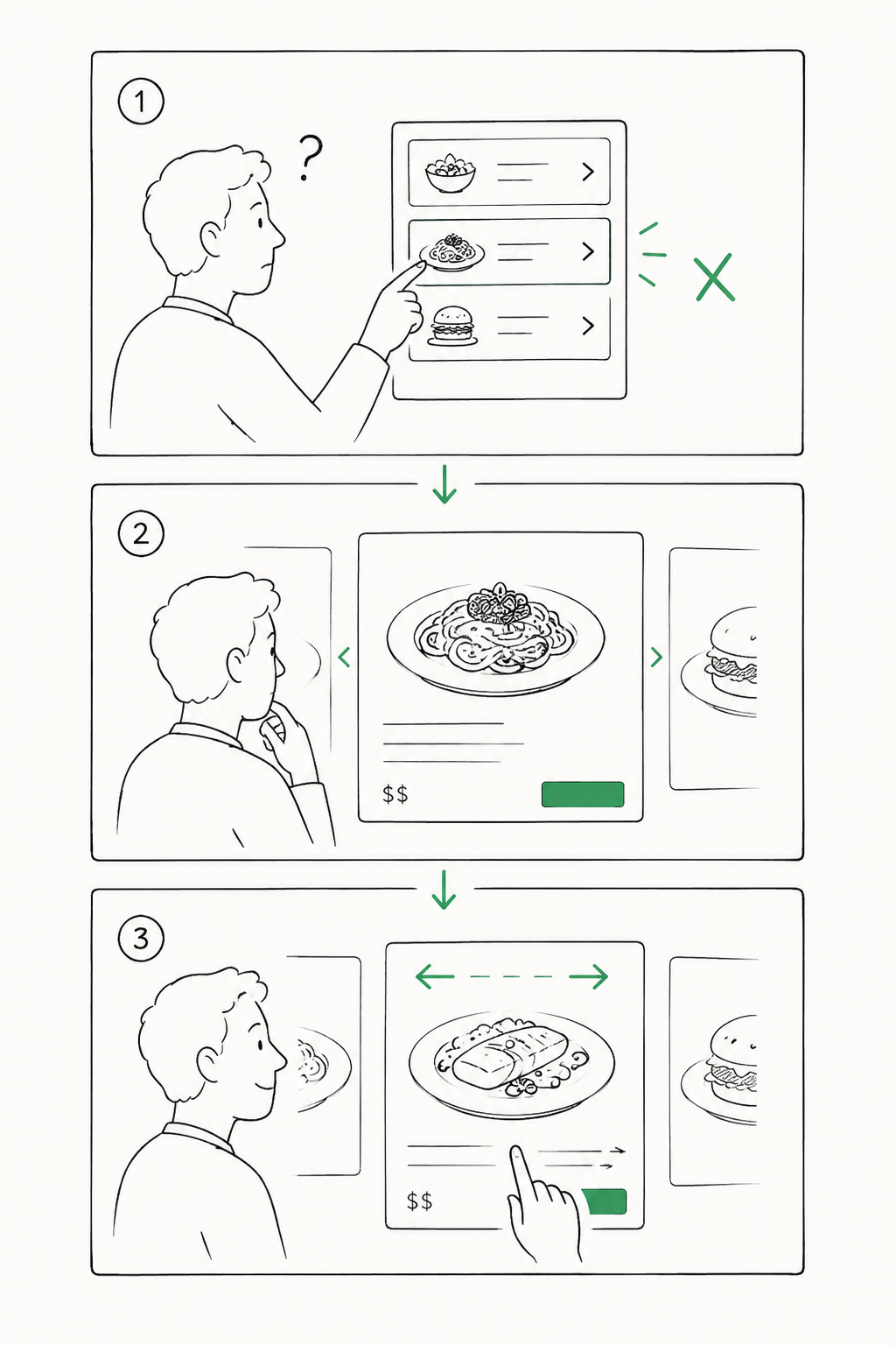
One evening at the restaurant, I noticed guests repeatedly tapping menu items.
Nothing happened.
The items had never been designed to open. They were simply rows containing a name, description and price.
The guests expected more.
If someone was interested in a dish, they instinctively tapped it to take a closer look. They expected a larger photograph, a clearer description or more information about its ingredients and allergens.
We had never taught them that a menu item should open. The apps they used every day had.
So we redesigned the menu. Each item could now open into its own full-screen view, giving the photography and description more space. Guests could focus on a dish without the rest of the menu competing for their attention.
For a brief period, I thought we had solved the problem.
Then I watched people use the new version.
They would open one dish, close it, scroll through the menu, open another and then return to the first. Some repeated this several times, trying to remember how one possibility compared with another.
The full-screen page was useful, but it had exposed a different need. Guests were not examining dishes in isolation. They were comparing possibilities.
So we redesigned the interaction again. Once a guest opened a dish, they could swipe directly to the next one rather than repeatedly opening and closing pages.
We had not invented anything new. We had borrowed an interaction that millions of people already understood and applied it to something they were naturally trying to do.
This was an important lesson for me as an engineer. My instinct was to think in terms of functionality: item pages, swipe navigation, saved lists, filters. Guests did not think in those terms. They were not asking for a more advanced menu.
They were asking for less effort between uncertainty and a decision.
The feature that started in my Notes app
One of BellQR’s most important features began with something I did when my wife and I went out for dinner.
I would often narrow the menu down to two or three dishes, then forget one of them before the server returned. To avoid searching through the menu again, I started typing the names of the dishes into the Notes app on my phone.
It was not an elegant system, but it worked.
Later, while watching guests use BellQR, I began noticing similar behaviour. People moved between starters, mains and specials, mentally collecting possibilities. They showed dishes to each other and asked questions across the table. Sometimes they returned to the same item several times before deciding.
They were building a shortlist.
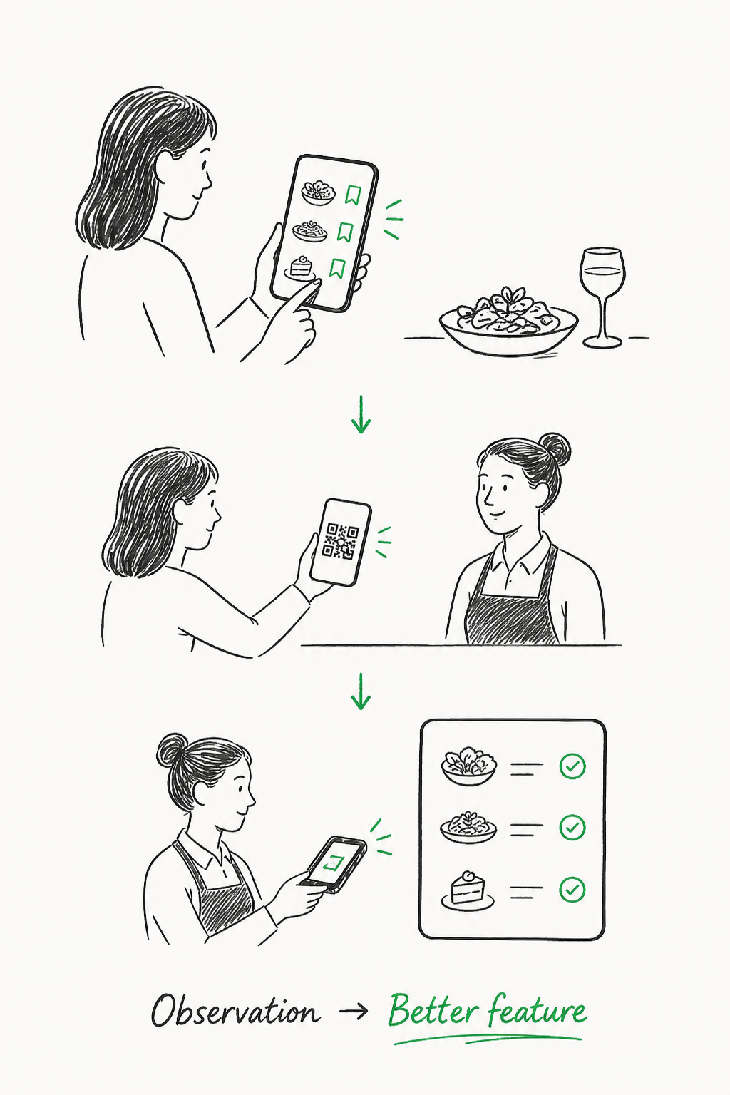
That became Saved Items. A guest could tap a heart icon beside any dish and collect the options they were considering in one place. They no longer needed to remember where they had found something or scroll through the entire menu again.
The idea came partly from my own Notes app habit, but the restaurant showed us what the feature really needed to become.
Guests began presenting their saved lists to servers.
Instead of reading each dish aloud, they would turn the phone around and show the screen. A feature intended to help an individual remember their options had quietly become a communication tool between the guest and the restaurant team.
So we followed the behaviour.
BellQR began generating a QR code linked to a guest’s saved items. A server could scan the code using their own phone, see the complete list and tick items off while entering the order into the restaurant’s point-of-sale system.
It was a simple bridge between two people. The guest kept control of their shortlist, while the server could view it clearly without taking the guest’s phone or trying to read a screen from across the table.
Unfortunately, the first time the feature was used, I had forgotten one rather important detail.
I had deployed it without telling the servers.
About half an hour later, one of them came over looking completely confused. A guest had asked him to scan a QR code on their phone, and he had absolutely no idea what they were talking about.
The software had worked perfectly.
I had remembered to ship the feature and forgotten to onboard the humans.
We laughed about it afterwards, but the moment stayed with me because the entire evolution of Saved Items had come from observing real behaviour.
I had started with a problem I experienced myself. Guests then showed us that they were using the feature in a way we had not anticipated. That behaviour suggested another improvement, which created a new interaction between guests and servers.
None of it emerged from sitting in a meeting and asking what features a digital menu ought to have.
The product evolved because people showed us what they were already trying to do.
Guests will often reveal how something should work long before they can describe the feature they need. The challenge is noticing.
Information is only useful when it removes uncertainty
This changed how I thought about almost every part of a menu.
Consider photography. Restaurants often debate whether menu photographs look helpful or unsophisticated, whether every dish should have one or whether images should be reserved for a few signature items.
Those can be useful creative decisions, but they miss the more important question: what is the photograph helping a guest understand?
A good photograph is not simply decoration. It can reassure someone that the dish they are imagining is close to the dish they will receive. It can clarify portion size, presentation or an unfamiliar style of food. Sometimes it answers a question that would take several sentences to explain.
Descriptions serve the same purpose. Longer descriptions do not automatically make a menu more useful. The best ones provide the details a guest needs to feel comfortable making a choice, without burying the dish under unnecessary language.
Dietary information, allergens and ingredients work in much the same way. They may not be the reason someone is excited by a dish, but they can be the reason someone feels able to order it.
Translations are also about more than converting words from one language to another.
What frustrated me in Sicily was not simply the presence of Italian text. It was the uncertainty created by an incomplete translation. Was I ordering what I thought I was ordering? Had I misunderstood an ingredient? Was I overlooking a dish because I could not work out what it was?
Every unanswered question adds a little friction. Every clear answer removes some.
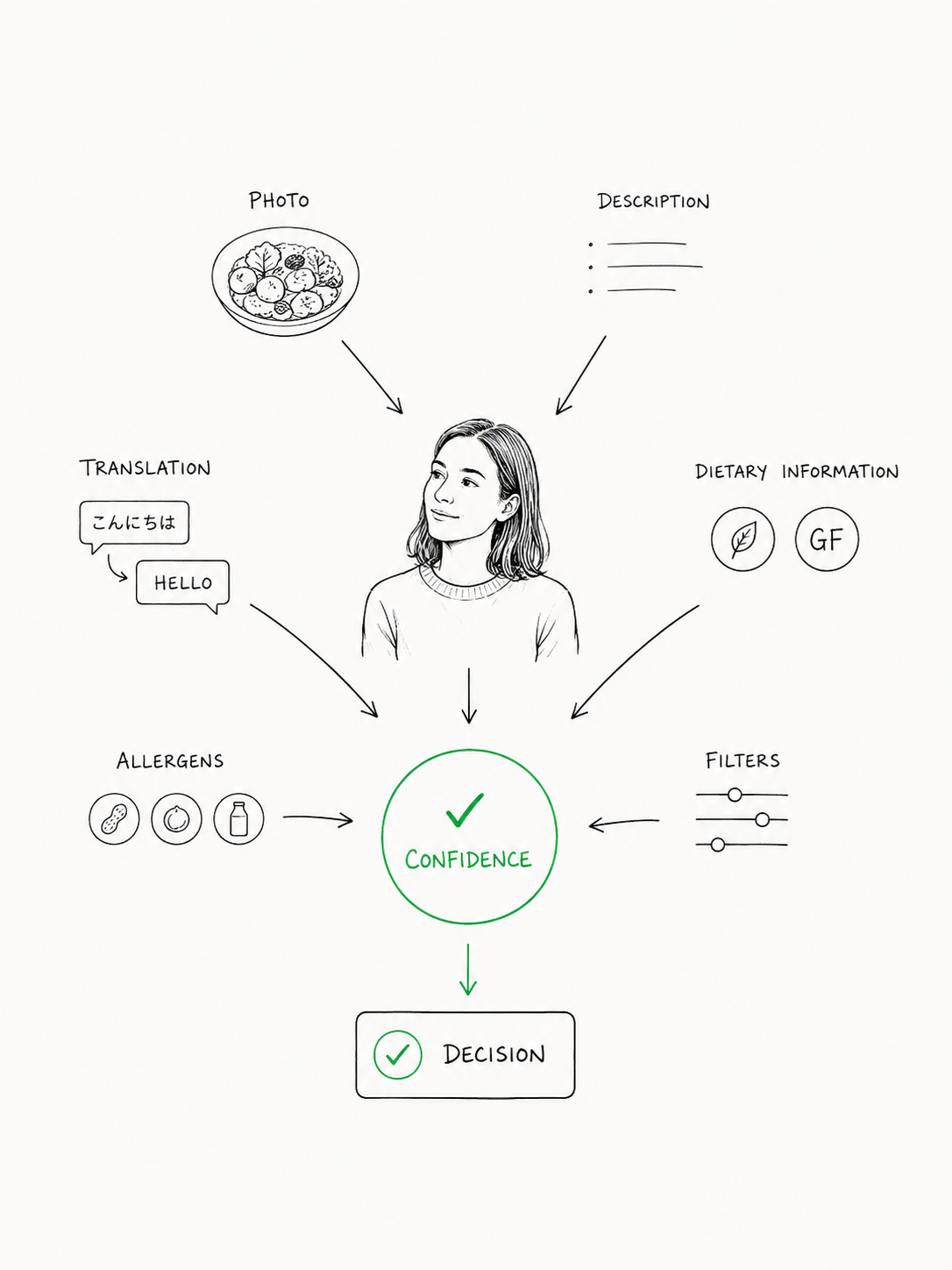
Digital menus can present an extraordinary amount of information, but that does not mean they should. A menu can include photographs, long descriptions, ingredient lists, labels, filters, badges, recommendations and animations, yet still leave a guest feeling overwhelmed.
Presenting information and helping someone reach a decision are not the same thing.
The goal is not to show everything the system knows. It is to make the right information available at the moment a guest needs it.
Sometimes that means displaying an allergen clearly. Sometimes it means allowing someone to compare dishes without losing their place. Sometimes it means translating an unfamiliar ingredient, or simply making a category easy to find again.
Individually, these are tiny interactions. Together, they determine whether choosing dinner feels effortless or exhausting.
The least interesting part of a QR menu
People have surprisingly strong opinions about QR menus.
Some see them as the inevitable future of restaurant dining. Others hope they disappear completely. One side talks about convenience, while the other talks about phones at the table and the pleasure of holding a printed menu.
I do not think restaurants need to choose one side.
A beautiful printed menu can be a wonderful part of a dining experience. A well-designed digital menu can provide translation, dietary filtering, richer photography and other forms of assistance that paper cannot easily offer. In many restaurants, the best answer may be to provide both.
What matters is whether each version helps the guest.
The QR code itself is rarely the deciding factor. It is simply how someone arrives at the digital experience. In most cases, it is the least interesting part of a QR menu.
The menu is far more important.
It is one of the few experiences almost every guest shares. Some order cocktails and others do not. Some stay for dessert. A small percentage leave a review. But nearly everyone spends time with the menu.
It shapes the first part of the meal. It introduces the food, sets expectations and starts conversations around the table. It influences what people notice, what they ignore and how confident they feel when the server arrives.
That is a surprisingly important responsibility for something restaurants often treat as a document that needs to be uploaded, printed or copied onto a screen.
A menu is part of the guest experience.
Once we started treating it that way, the questions we asked changed.
Instead of asking, What feature should we build next?, we began asking, What made this decision harder than it needed to be?
The first question tends to produce more software. The second tends to produce a better experience.
Sometimes the answer is a new feature. More often, it is clearer wording, simpler navigation, a familiar interaction or the removal of something that was getting in the way.
Good product design is not always about adding more. Often, it is about recognising the small moments of effort that have become so normal nobody thinks to question them.
Watch what guests do
If you own or run a restaurant, spend one evening watching how guests use your menu.
Do not begin by asking whether they like it. People are often polite, and a general question tends to produce a general answer. Instead, pay attention to what happens while they are deciding.
Notice where they pause. Watch what they compare and what they overlook. See whether they scroll back and forth, point to items across the table or ask someone else to find a section. Listen to the questions they ask the server before ordering.
Pay particular attention to the small moments that appear insignificant.
A guest reopening the same dish.
Someone struggling to return to a category.
A couple passing a phone between them.
A diner checking the same dietary detail twice.
A server leaning over to read a screen.
These moments may last only a few seconds, but they often contain more useful information than a page of feature requests.
That is what the restaurant became for me. It was not simply a convenient place to test software. It was a classroom.
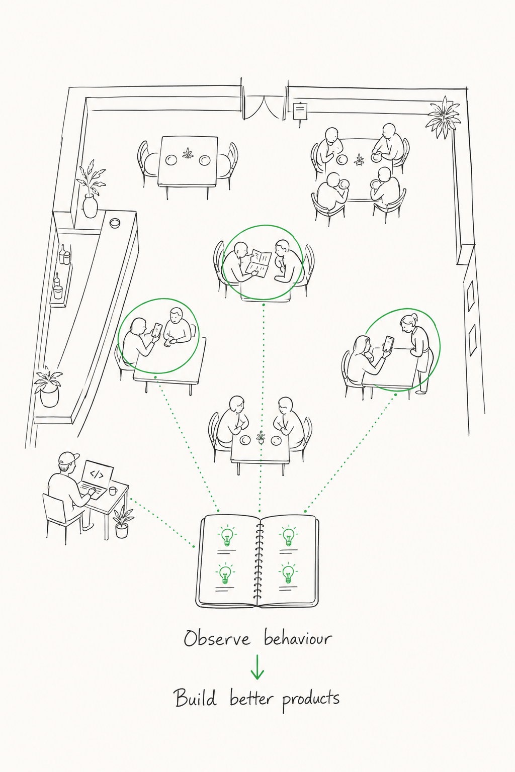
Each evening, guests showed me where our assumptions were wrong. They demonstrated which interactions felt natural, where information was missing and which supposedly useful ideas did not matter to them at all.
The process was humbling. It was also addictive. I could deploy a change, watch how people responded and learn something new before the evening was over.
Six months earlier, I had assumed the difficult part would be writing the software.
It wasn’t.
The difficult part was learning to see what guests were trying to do before they could explain it.
When I started, I thought I was building QR menu software.
Looking back, I think I was learning how people make decisions.
The best restaurant menus do not simply show people what is available. They help them decide what is right for them.
And every decision we make should help guests make theirs.